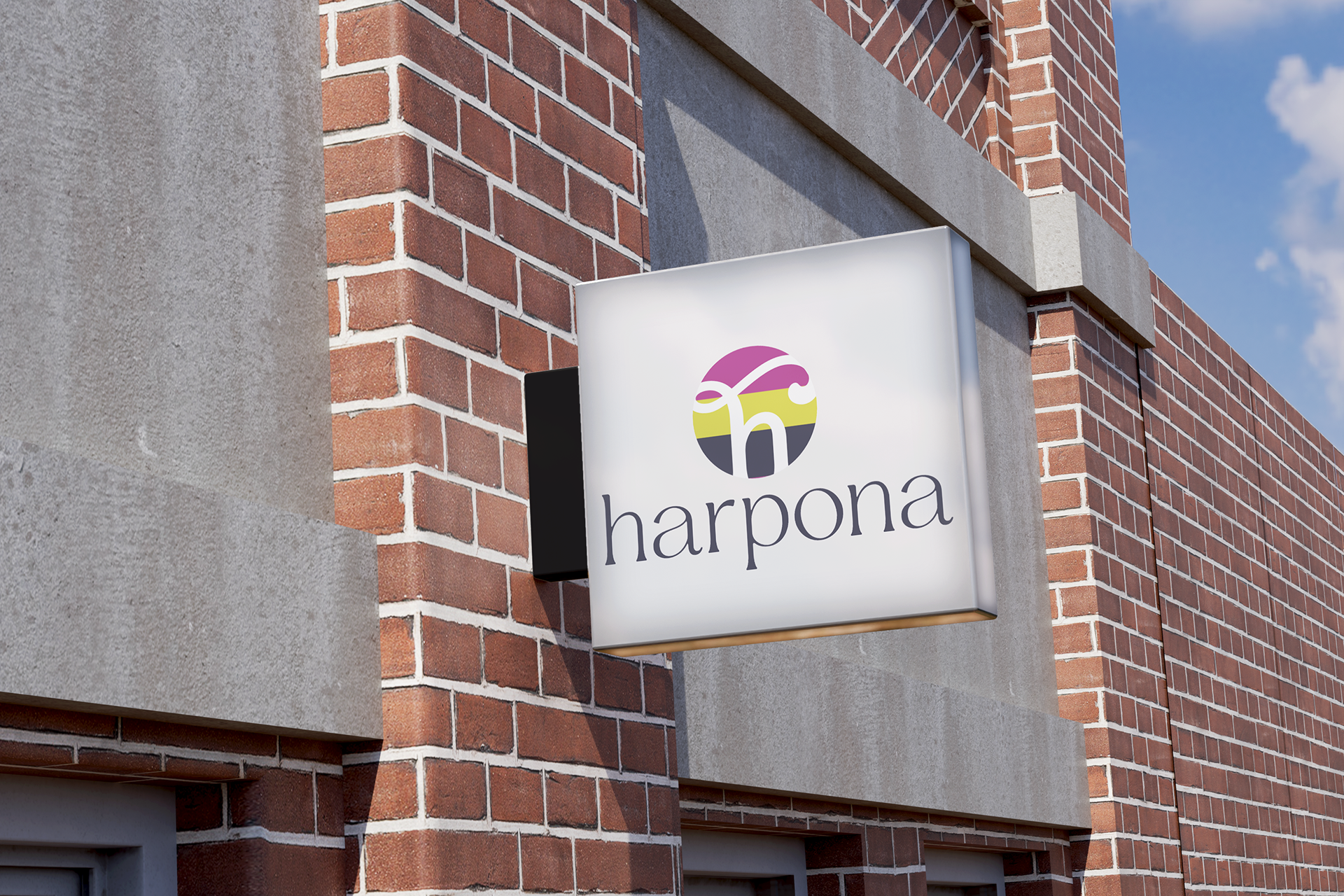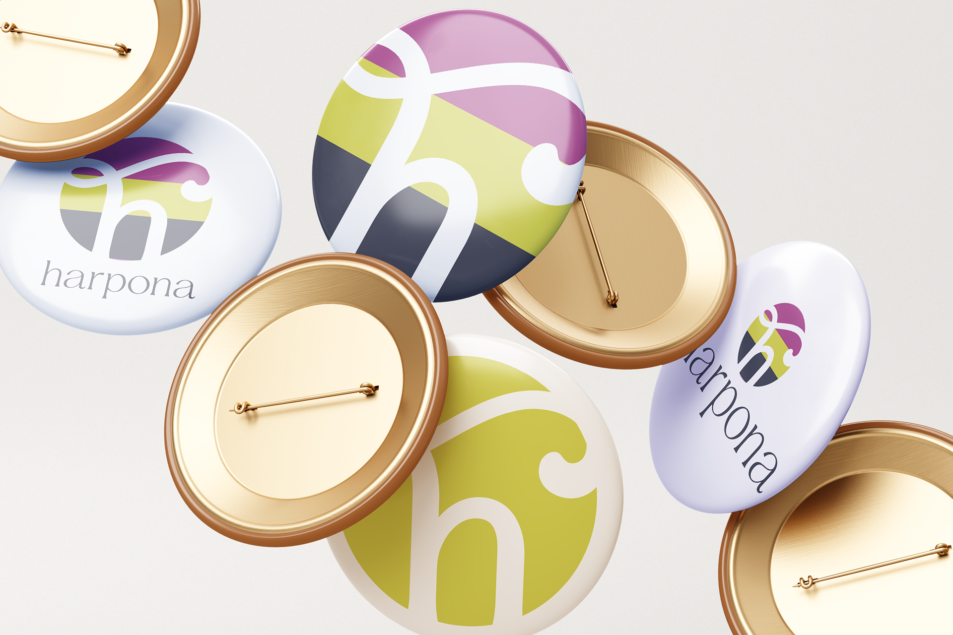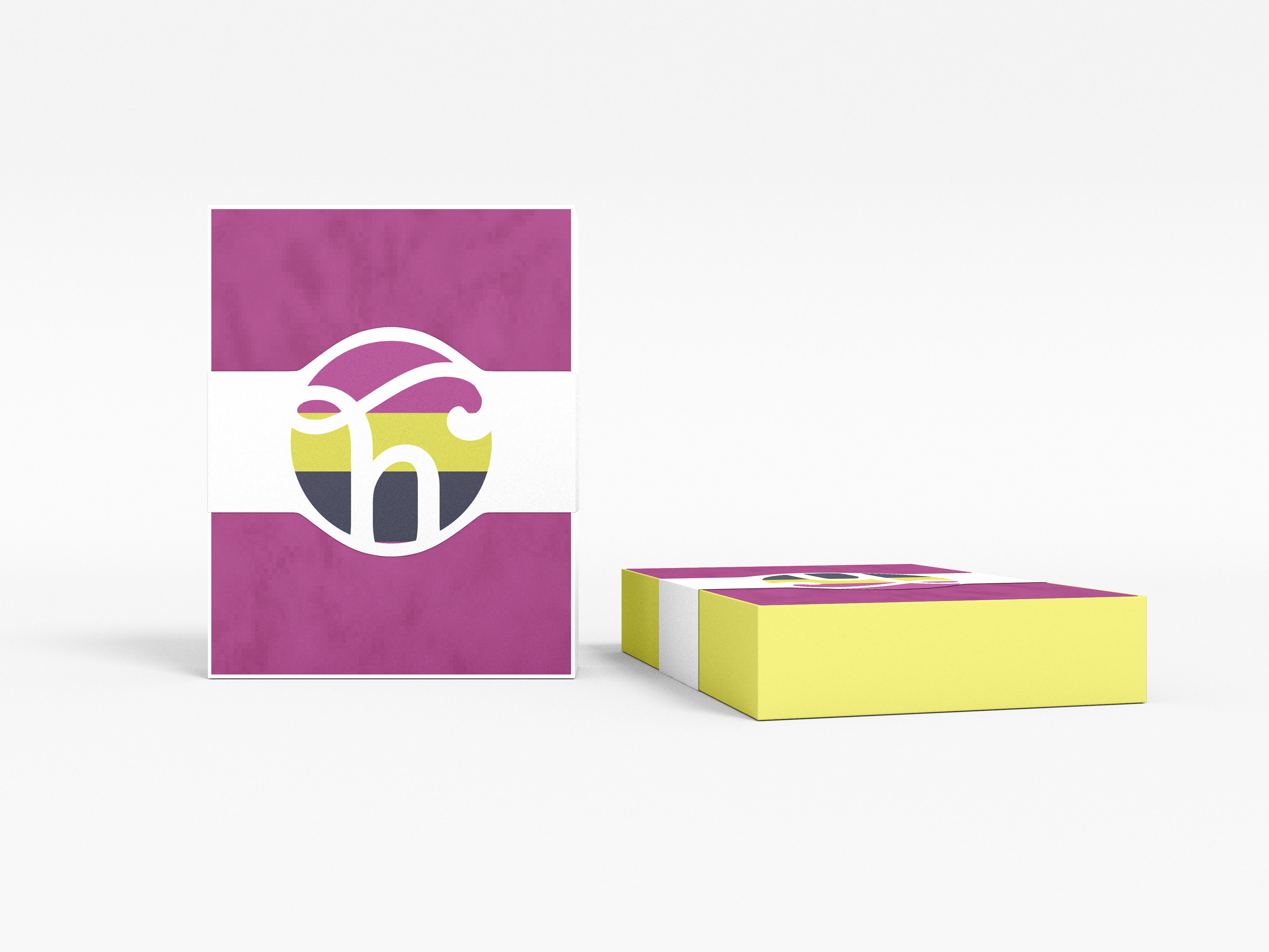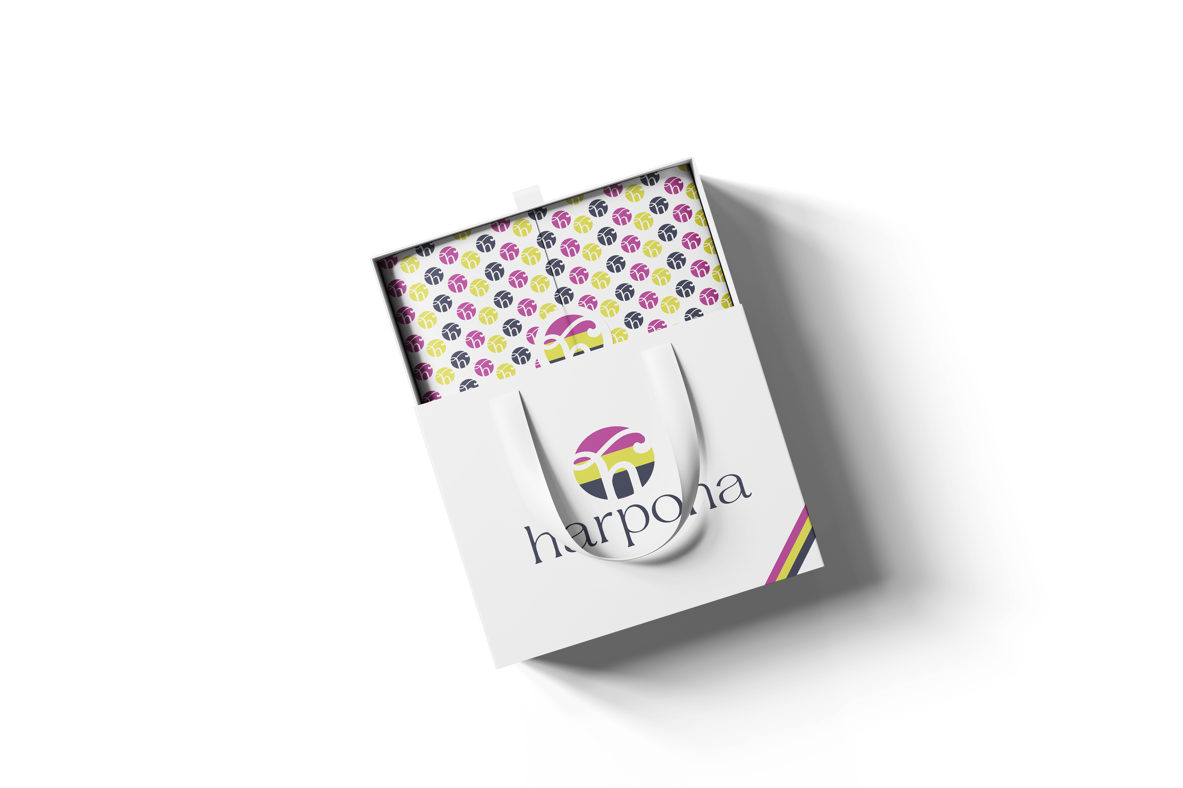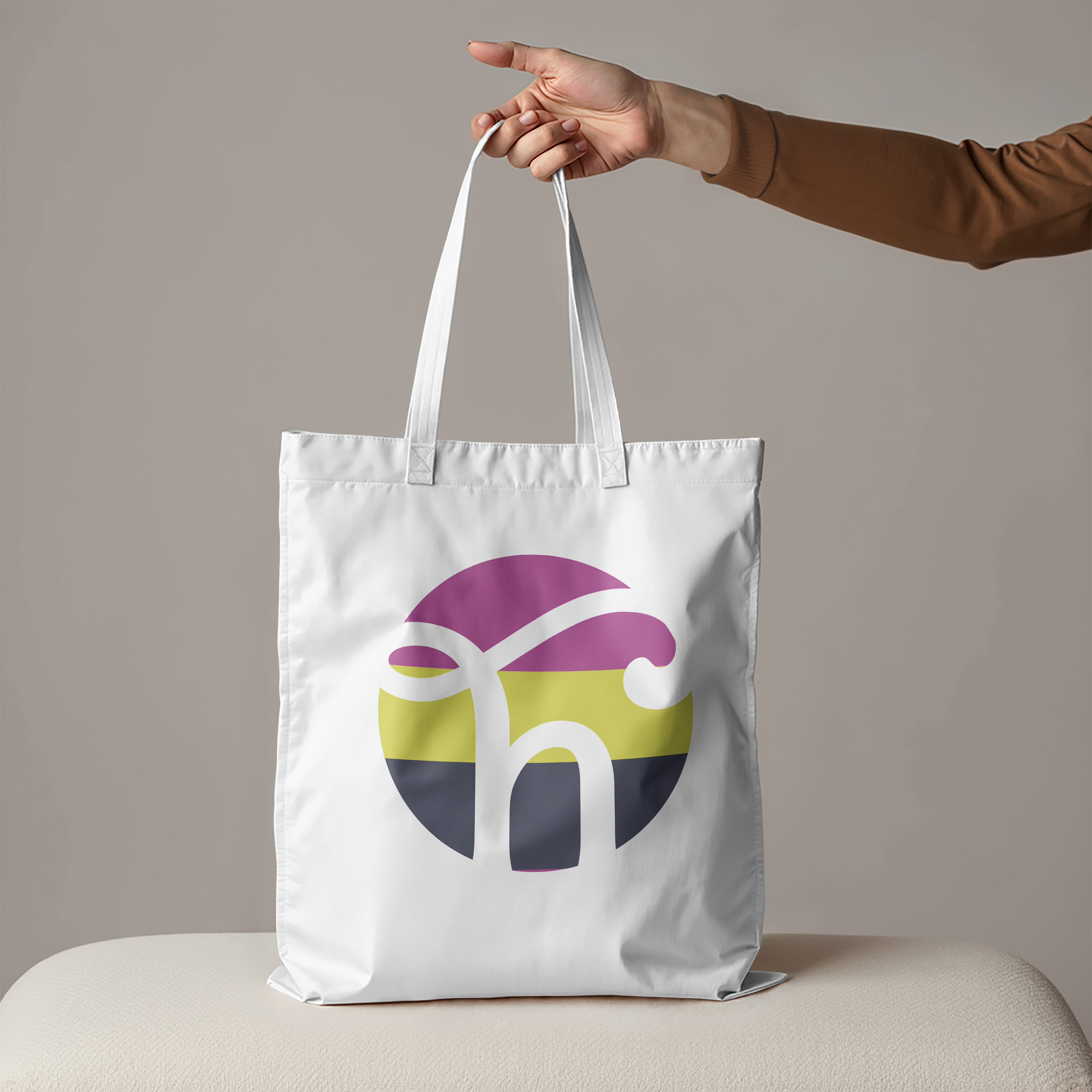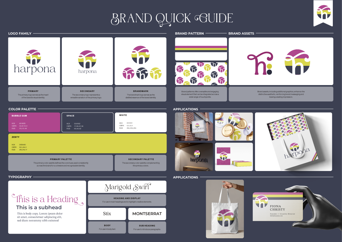
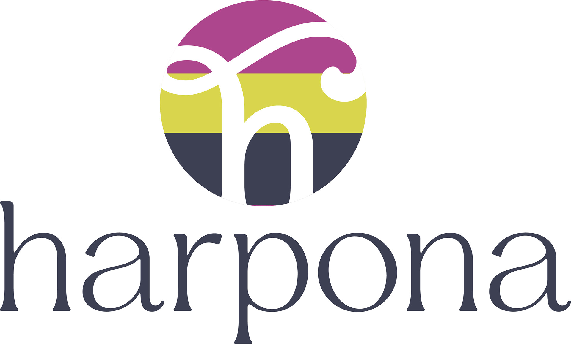
Logo Design
The Harpona logo is clean, modern, and bold, designed to feel timeless while still standing out in a crowded creative landscape. Strong typography communicates confidence and authority, while subtle design details bring in a sense of personality and adaptability. The simplicity allows the logo to flex across applications, from digital to print to social.
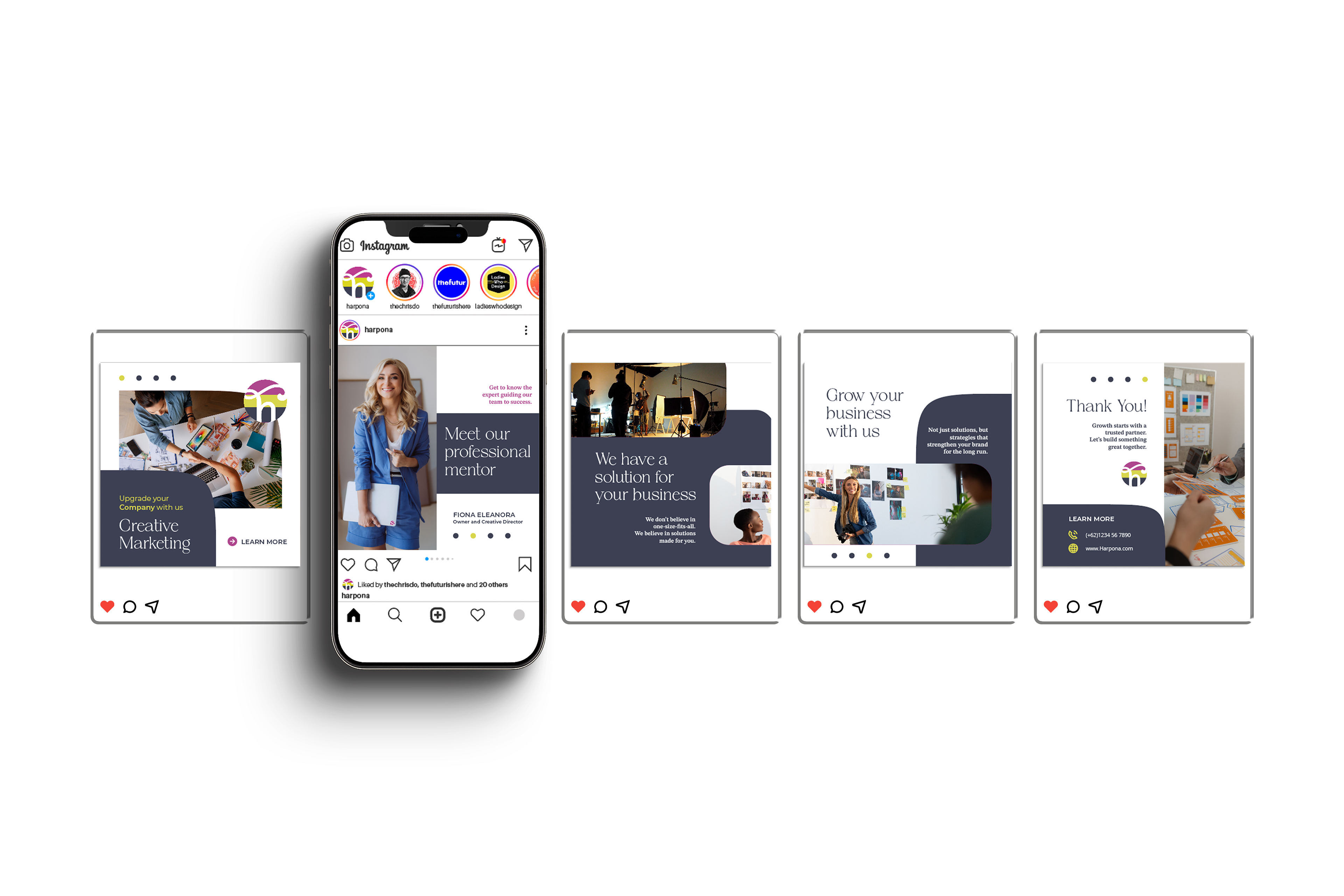
Color Palette
The color system was designed to balance energy and clarity. Bold colors anchor the brand with strength and consistency, while secondary tones introduce flexibility and creative flair. The palette was built to work seamlessly across branding touchpoints—web, social, campaigns—without losing its distinct identity.
Typography
Typography plays a central role in Harpona’s design language. A modern typeface was chosen for its clean geometry and versatility, reflecting both clarity and contemporary style. Paired with bold headline treatments, the type system reinforces Harpona’s commitment to delivering work that’s sharp, strong, and impactful.
Result
The Harpona identity delivers a strong foundation for a brand that thrives on collaboration and creativity. Every element—from logo to color to voice—was crafted to reflect the studio’s core values: creativity without compromise, strategy with purpose, and design that works as hard as it looks.